With the rise of wearable technology, smartwatches have become increasingly popular as a convenient and stylish way to stay connected. Smartwatches are no longer just fashion accessories, but a personal assistant that can track our fitness, receive notifications, control smart home devices, and more. However, with so many features packed into such a small device and limited input options, designing a user-friendly interface for a smartwatch can be a unique challenge.
In this article, we will explore the UX/UI design of smartwatches and how designers can create an intuitive and efficient user experience for users. We will delve into the various design principles, such as usability, navigation, and visual hierarchy, that should be considered while designing smartwatch interfaces. So, if you are interested in creating a seamless and enjoyable user experience for smartwatch users, then this article is for you.
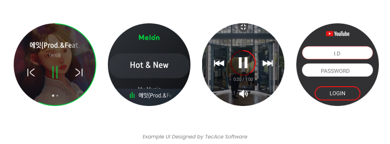
Consider glanceability
Smartwatch UX glanceability refers to the ability of a smartwatch user interface to convey information quickly and efficiently at-a-glance. Because smartwatches have limited screen real estate and are often used in situations where the user is on the go or has limited time, it is important that the user can easily and quickly access the information they need without having to spend a lot of time interacting with the device.
The Impact of minimal design in delivering essential content information
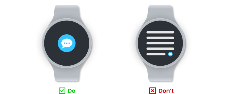
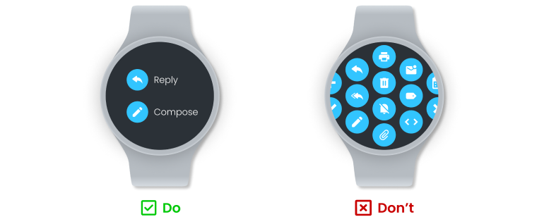
Limiting the primary actions to one or two is crucial as it allows users to select the appropriate action easily and quickly without any hassle.
Due to the limited space available on devices like smartwatches, it's difficult to include all features in one place. Trying to do so may cause users to lose sight of what's important, confusing, and frustrating. Such an outcome is undesirable and should be avoided. When designing a smartwatch app, prioritize primary operations and avoid including unnecessary features, actions, or content in the user interface.
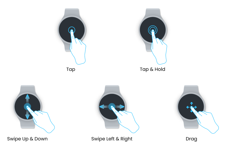
Gesture is not typically considered when designing for smartphones, but it is a must when designing for smartwatch. It's important to review the design guidelines for gesture compatibility with on-screen actions when using smartwatches running different operating systems.
The goal is to make the experience seamless and natural, allowing users to navigate through the smartwatch's features effortlessly. There are several types of gestures that can be used when creating smartwatch designs. Here are some of the most common ones:
- Tap: A single tap on the smartwatch screen can be used to select an item, launch an app, or initiate an action.
- Swipe: Swiping left or right can be used to navigate through screens while swiping up or down can be used to scroll through lists or menus.
- Double tap: A double tap gesture can be used to zoom in or out on an image or text.
- Pinch: Pinching can be used to zoom in or out on an image or map.
- Twist: Twisting the wrist can be used to scroll through menus or messages, dismiss notifications, or adjust settings like volume or brightness.
- Press and hold: A press and hold gesture can be used to access contextual menus, launch voice commands, or perform other actions.
- Shake: Shaking the wrist can be used to dismiss notifications or clear a screen.
- Tilt: Tilting the wrist can be used to activate specific functions, navigate through menus, or bring up notifications.
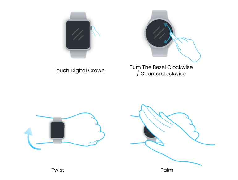
Some smartwatches have their unique functions to activate certain features. For instance, Apple watch has Digital Crown which is a small button with rotating dial located on the side of the watch. It can be used for scrolling, zooming, going to Homescreen, calling Siri, and more. On the other hand, Samsung watch has bezel which is the outer ring that surrounds the watch face. Users can physically rotate clockwise or counterclockwise to interact with the watch and perform various actions.
These common actions might not be compatible with certain devices with certain OS. Again, when working with smartwatches that operate on different operating systems, it is crucial to review the design guidelines for gesture compatibility with on-screen actions.
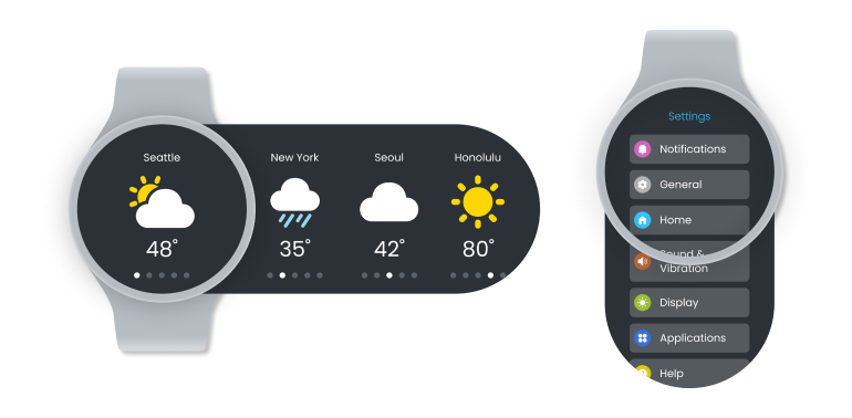
When creating an app with multiple screens, it's crucial to select the most suitable navigation model that aligns with design and development requirements. Many smartwatch developers suggest page-based and hierarchical models when designing an app.
Page-based Model:
- Page-based model is a design approach that involves breaking down a smartwatch's interface into separate screens or pages, each with its own set of information or functions. In this design model, users can navigate through the different pages by swiping horizontally or vertically, just like flipping through the pages of a book.
- Each page is dedicated to a specific task, such as displaying the time, tracking fitness data, or accessing apps. The page-based model also allows designers to prioritize the most important information or functions and place them on the main pages, while less critical information can be placed on secondary pages.
- Overall, the page-based model is a popular design approach for smartwatch UX/UI because it allows for easy navigation, efficient use of screen space, and effective organization of information and functions.
Hierarchical Model:
- The design approach of the hierarchical model for smartwatch UX/UI involves the arrangement of the interface into a hierarchy of functions and information, based on the concept of information architecture that is used in organizing and structuring content on websites or applications.
- In the hierarchical model, the smartwatch's interface is broken down into a series of nested layers or menus. The main menu is the top level of the hierarchy, containing the most important or frequently used functions. Each item in the main menu can lead to a sub-menu, which contains more detailed information or additional options.
- For example, the main menu may contain options for fitness tracking, messaging, and weather. Selecting the fitness tracking option may lead to a sub-menu with options for running, cycling, or swimming. Selecting the running option may then lead to a sub-menu with options for distance, time, or pace.
- Designers can use this hierarchical model to create a more systematic and effective interface by grouping related functions together and making it easier for users to navigate through different levels of information. Additionally, it allows designers to prioritize the essential information and functions by placing them in the top-level menu.
- However, this model can become complex if there are too many layers or if the hierarchy is not intuitive. Therefore, designers must carefully consider the information architecture and user flow to ensure that the hierarchical model is easy to use and understand.
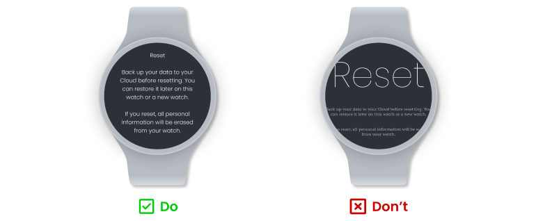
Smartwatch interfaces typically prioritize displaying real-time data that is easily visible at a glance. Therefore, typography and font selection are crucial aspects of the design process. To minimize interaction costs and user frustration, consider the following suggestions:
- Try to use system fonts. Utilize native fonts to reduce potential compatibility issues and keep the design simple.
- Avoid using thin weights of small sizes. Thin fonts are not legible in smaller sizes.
- If you decide to use custom fonts, be cautious when using custom fonts, as they can communicate a brand's personality. However, it's advisable to limit the use of more than one additional typeface in your app. Using too many can make the interface appear disorganized.
In designing for a small screen, it is important to consider how text and UI elements are placed on the screen to ensure that it is easily readable and visually pleasing. The placement of text and UI elements can impact the user's ability to quickly access information and interact with the interface.
It is generally a good idea to keep the most important information and UI elements in the center of the screen. This is because the screen real estate on a smartwatch is quite limited, and users often interact with the device using just one hand. Placing text and UI elements in the middle of the screen can help ensure that they are easily visible and accessible to the user.
However, it's important to keep in mind the specific design and layout of the smartwatch you are designing for. Some smartwatches may have different screen shapes and sizes, and different interface designs. It's also important to consider the specific user experience and context in which the smartwatch will be used, such as the user's activity level and the environment in which the device will be worn.
Overall, it's a good rule of thumb to keep important information and UI elements in the center of the screen, but ultimately the best design approach will depend on the specific smartwatch and user needs.
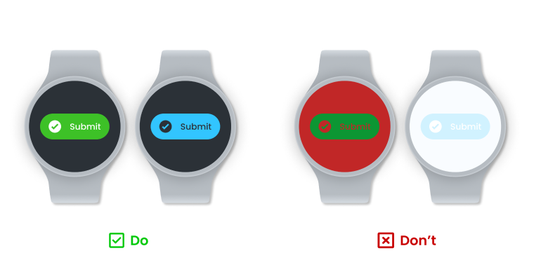
In smartwatch UX design, colors play a crucial role in creating a strong UI hierarchy in a limited space. When combined with shapes and buttons, colors can reinforce the hierarchy and offer clear navigation paths for users.
When working with colors, keep in mind the following:
- Context matters. Choose colors that convey the right message for your app. For example, using a bright red background during meditation in a mindfulness app would be inappropriate.
- Contrast is important. Ensure that there is enough contrast between the background and foreground colors to make text and icons easily visible. This is particularly important given the small size of smartwatch screens.
- Limited color palette: Smartwatch screens are typically small, so it’s important to use a limited color palette to avoid overwhelming the user. A good approach is to use a few primary colors and then add variations of these colors to provide depth and variety.
- Consistency: Consistent color schemes can help users quickly recognize your brand and distinguish your app from others. Use a consistent color palette throughout your app to maintain a consistent look and feel.
- Consider color blindness: Avoid using color combinations such as red and green which may be difficult for colorblind users to differentiate.


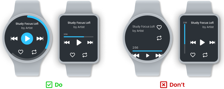
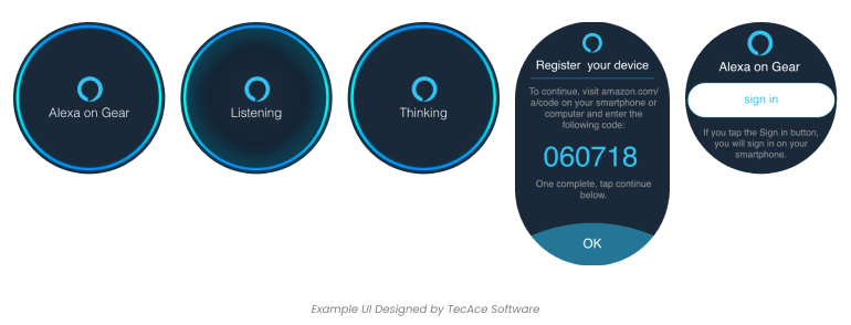
The primary purpose of a smartwatch, similar to any watch, is to provide quick access to important information. While animations do not necessarily align with this objective, they do have their advantages.
Incorporating a limited number of animations into your smartwatch UX design can increase interactions without overwhelming users.
- Keep animations brief: short animations effectively communicate necessary information and avoid frustrating users by minimizing wait times.
- Have a specific purpose: Ensure that animations have a functional purpose, such as providing context and drawing attention to specific parts of your interface.
- Limit the number of concurrent animations: Too many simultaneous animations can impact your app's responsiveness and make it difficult for users to follow the animations.
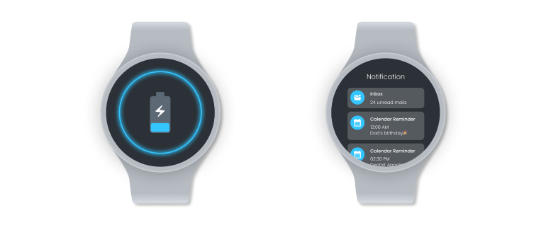
The battery life of wearables is steadily enhancing due to the increasing use of power-efficient Bluetooth Low-Energy (BLE) technology. However, designing a smartwatch app that is both user-friendly and battery-efficient can be a challenge. In fact,
- Use dark backgrounds: A dark background can reduce battery consumption on smartwatches.
- Optimize graphics: Use optimized graphics that are optimized for smartwatch screens. High-resolution images and graphics can be a battery drain, so use images that are appropriately sized and compressed.
- Utilize push notifications: Rather than constantly polling for new data, use push notifications to update the user when new data is available. This can help reduce battery consumption by reducing the amount of time the app needs to actively run.
- Utilize dock feature: Encourage users to use the dock feature. It is a place where users can access their favorite and recently used apps in their previous state this is one of the most beneficial features because it conserves processor and battery usage while enabling easy access to the apps.
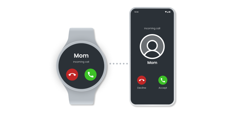
Smartwatches offer a fast way to access information, but users might want to use other devices to explore the content in greater depth.
When designing for mobile devices, it's vital to consider how mobile and smartwatches can complement each other. User progress must be synchronized, and users should be able to switch between devices with ease, continuing their journey from where they left off.
A smartwatch is a wearable technology that has become increasingly popular in recent years due to its ability to offer a wide range of features and functions. However, despite the many capabilities of a smartwatch, it is often seen as a complementary product to a mobile device, such as a smartphone, and relies on various functions of the mobile device in order to work effectively.
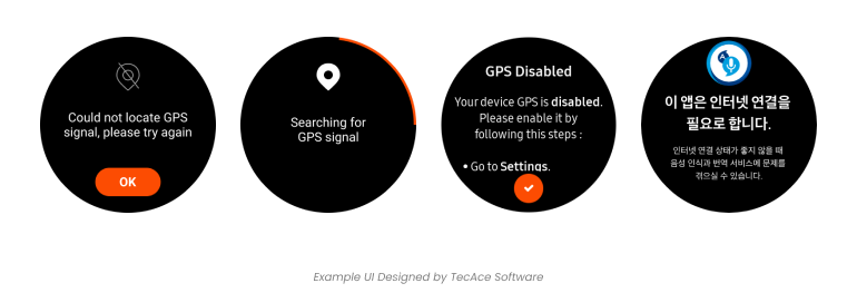
Connectivity issues can arise with wearables, just like with any other digital device. It's important to ensure that core functionality is available in offline mode whenever possible. When designing the UX/UI for smartwatches in offline mode, it's important to focus on providing a simple and intuitive interface that allows users to easily access the most important features and functions. This can include features like timekeeping, fitness tracking, and music playback, as well as basic messaging and calling capabilities.
To ensure a seamless user experience in offline mode, smartwatch designers must also consider how the device will sync with other devices once it reconnects to the internet or other devices. This may involve developing specialized software that can quickly and efficiently sync data between the smartwatch and other devices, such as syncing fitness data with a smartphone app or syncing music playlists with a music streaming service.
Overall, designing the UX/UI for smartwatches in offline mode requires a focus on simplicity, efficiency, and seamless syncing capabilities to ensure a positive user experience
When making a smartwatch app, the objective is to create a seamless experience that merges the hardware and software. The interaction should resemble that of traditional watches: quick and effortless. The priority of smartwatch UX is to ensure speedy and comfortable interaction. Users should not feel like they are interacting with a computer, but rather a personal device that simplifies their daily routine.
Designing for smartwatches can be challenging, as the small screen size and limited processing power of the device require careful consideration of user experience and interface design.
To help designers tackle this challenge, TecAce created a checklist of considerations to reference when designing for a smartwatch. By following these considerations, we hope you can create smartwatch applications that are both user-friendly and effective.
Physical Space Limitation
Gestures
Navigation
Typography
Text & UI Elements Placement and Alignment
Color & Contrast
Animation & Lightweight Interaction Design
Battery Consumption
Click HERE to download the checklist